How to Build a Mobile-Friendly Website with No Coding Skills
In today’s digital world, having a mobile-friendly website isn’t just a luxury—it’s a necessity. With over 60% of web traffic coming from smartphones, businesses, bloggers, and creators must ensure their websites are optimized for mobile devices. The good news? You don’t need any coding skills to create a responsive, mobile-ready site.
1. Why Mobile-Friendly Matters
Mobile users expect fast-loading, easy-to-navigate websites. If your site isn’t mobile-optimized, visitors will quickly leave—and search engines will notice. Google prioritizes mobile-friendly websites in its search rankings. That means better visibility, higher engagement, and more conversions.
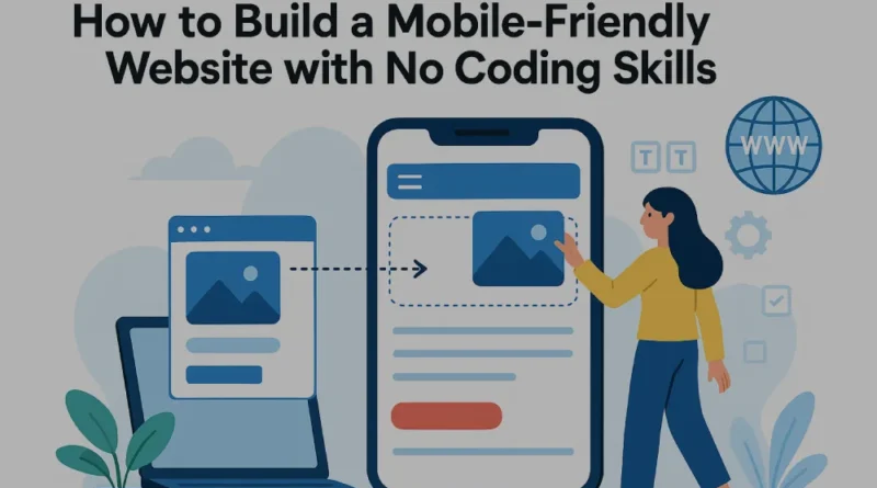
2. Use Website Builders
Thanks to no-code website builders, anyone can create a professional-looking mobile-friendly website without touching a line of code. Platforms like Wix, Squarespace, Shopify, and WordPress.com offer pre-designed templates that are fully responsive. These builders allow you to drag and drop elements, customize layouts, and publish your site in hours.
3. Choose a Responsive Template
The key to mobile-friendliness is responsiveness. Choose a template that automatically adjusts to screen sizes—from smartphones to tablets to desktops. Most website builders label these templates as “mobile-optimized” or “responsive,” so they’re easy to find.
4. Keep It Simple and Fast
Mobile users value speed and simplicity. Avoid cluttered designs, large images, or complex menus. Use short paragraphs, legible fonts, and large buttons for easy navigation. Compress your images using free tools like TinyPNG to improve load times.
5. Preview and Test on Mobile
Before publishing, use your builder’s mobile preview mode to see how your site looks on different devices. You can also test it live using Google’s Mobile-Friendly Test tool. This will help you identify and fix any issues before your visitors do.
6. Keep Updating Your Content
A mobile-friendly site isn’t just about design. Regularly update your content to keep visitors engaged. Add a blog, share news, or feature customer testimonials. Most builders offer built-in blogging tools that are mobile-friendly by default.
Final Thoughts
Creating a mobile-friendly website with no coding is easier than ever. With the right tools and a bit of creativity, you can build a site that looks great and performs well across all devices. Whether you’re starting a business, promoting your portfolio, or blogging for fun—your mobile audience will thank you.
Disclaimer
The information presented in this blog is derived from publicly available sources for general use, including any cited references. While we strive to mention credible sources whenever possible, Best Web Design Agency in Mumbai does not guarantee the accuracy of the information provided in any way. This article is intended solely for general informational purposes. It should be understood that it does not constitute legal advice and does not aim to serve as such. If any individual(s) make decisions based on the information in this article without verifying the facts, we explicitly reject any liability that may arise as a result. We recommend that readers seek separate guidance regarding any specific information provided here.