The Ultimate Guide to Bento Grid Web Design for 2025
Website technology surpasses digital advertising functions in 2025. Websites today will advance beyond digital advertisements to function as genuine experiences for what people need and want. Web designers use bento grid layouts which derive their functionality from the precise organization system in Japanese bento box sections. This style serves as a fundamental component of bearable new trends. A company that seeks to modernize the look of their website would benefit from adopting this style. This particular style might help companies achieve their long-awaited success.
What is Bento Grid Web Design?
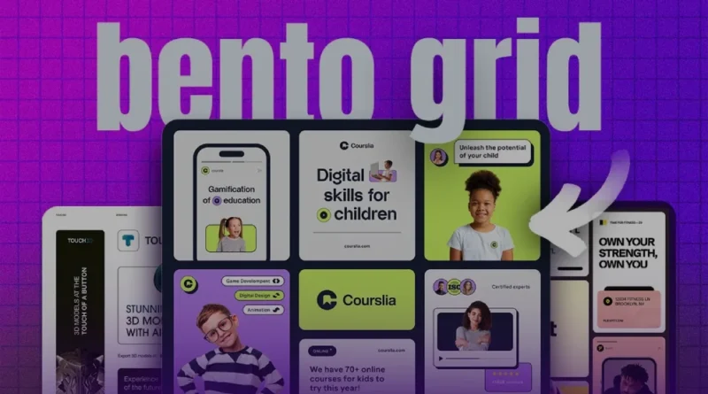
According to the bento grid concept the result emerges from actual circumstances making a modular wall unit that can construct new designs. Every bento box element contains unique content such as movies alongside photographs and names and buttons together with interactive schemes that maintain a specific yet appropriate order.
The standard grid pattern remains unchanged but bento grid types enable authors to present their message clearly through flexible structures that create appealing compositions. The multiple elements unite to form various visual presentations. The design fits both the principal message and forms an attractive visual narrative.
Why It Works in 2025
Web users throughout 2025 seek two things beyond simple clean design which include personalized entertaining content along with mobile-friendly interface options. The bento grid web design approach rules the contemporary web design trends of 2025 due to these fundamental reasons:
- Pure aesthetic appeal emerges directly from the modular structure which automatically attracts visitors while maintaining novelty.
- The design allows better content organization through using large blocks to present main messages and placing supporting details in smaller sections.
- Enhanced interactivity stems from Bento blocks as they allow addition of hover effects and animation features that improve user engagement levels.
- The design layout shows flexibility for content growth because adjustments remain consistent throughout the system.
- Mobile devices seamlessly display the adaptable design because it functions smoothly on various screen sizes from desktops to tablets to phones.
How to Approach Bento Design for Your Website
After proper planning Bento grid layouts prove to be practicable despite their initial complex appearance.
1. Map Your Content
Determine the essential content components including hero sections and product highlights and testimonials and services while giving each element priority designations that affect block resizing.
2. Choose a Platform
Most website builders in the market today offer users the ability to build flexible grid layouts for their websites. Webflow joins Framer and Elementor among the tools which enable bento-style design configuration through drag-and-drop editors. Customer-tailored professional development lets you have complete authority over your design.
3. Use Visual Hierarchy
Create grid design elements considering how users will experience them. The main visual features and message elements belong in larger blocks whereas smaller divisions should display CTAs, links and secondary details.
4. Design for Responsiveness
The design should adapt perfectly to screens of various sizes. The implementation of bento grids delivers excellent desktop performance yet a proper mobile configuration stands essential for holding onto users and achieving conversions.
Final Thoughts: A Stylish, Strategic Layout Choice
Establishing bento grid layout systems should be on your planning list when you need to update websites before 2025 begins. This design approach integrates attractive visual style through practical organizational features which generate an elegant structure.
Bento grid web design serves as an indicator that your brand adopts modern and structured methods while delivering content according to users’ preferred preferences of today. Digital designers along with businesses move toward innovative design approaches through this trend.
You are now ready to implement bento-style website organization. Work with design professionals who master modern grid techniques along with the skill to build brand-specific layout solutions.
Disclaimer
The information presented in this blog is derived from publicly available sources for general use, including any cited references. While we strive to mention credible sources whenever possible, Top Web Design Agency in Mumbai does not guarantee the accuracy of the information provided in any way. This article is intended solely for general informational purposes. It should be understood that it does not constitute legal advice and does not aim to serve as such. If any individual(s) make decisions based on the information in this article without verifying the facts, we explicitly reject any liability that may arise as a result. We recommend that readers seek separate guidance regarding any specific information provided here.