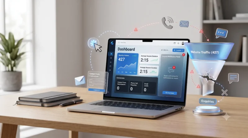
A few months back, a CA firm from Andheri West came to us with a problem that I honestly did not expect when I
first heard it. They were getting roughly 400 to 450 visitors to their website every month — not bad at all for
a local professional services firm in Mumbai. But their phone was silent. Their contact form was getting maybe 2
to 3 submissions per month, and on investigation, it turned out those were mostly spam.
Four hundred visitors a month and almost zero enquiries. That is not a traffic problem. That is a website
problem.
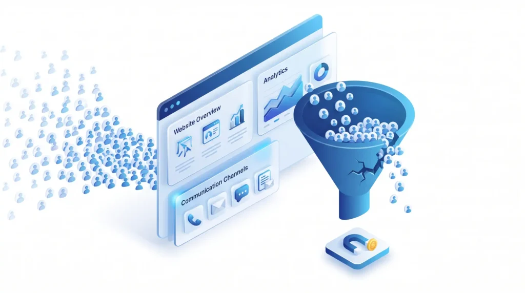
This situation is more common than most business owners realise. They look at Google Analytics, see a graph
showing visitors, and assume the website is doing its job. But website traffic and business enquiries are not
the same thing. A website that brings in visitors without converting any of them into leads is not a business
asset — it is just an expensive online brochure that nobody acts on.
The 8 Reasons Covered in This
Article:
Open your website on your phone right now. Not on Wi-Fi. Switch to your mobile data and load it fresh. Count
the seconds.
If meaningful content is not visible within 3 to 4 seconds, you are losing people before they have read a
single word about your business.
Google published research showing that 53% of mobile website visitors abandon a page that takes longer
than 3 seconds to load. In India, where a significant portion of users are on mid-range Android
phones with variable 4G connections, that threshold is even more unforgiving. A website that loads in 2 seconds
on a Mumbai fibre connection may take 7 to 9 seconds on a 4G connection in Thane.
I tested the websites of 10 small businesses in Andheri earlier this year as part of a local SEO audit we were
doing. Seven of them scored below 45 on Google’s PageSpeed Insights mobile test. One scored 18. That particular
site — a logistics company — was loading background video on the homepage. Beautiful on a desktop. Completely
unusable on the mobile phones of the freight customers they were trying to attract.
Speed problems come from a few common sources: images that were never compressed before uploading (a single
uncompressed photo can be 4 to 8MB), no caching configured on the server, too many plugins running
simultaneously on WordPress, or heavy animation scripts that fire before the main content loads.
How to check yours: Go to pagespeed.web.dev, enter your URL, and run the
mobile test. A score below 50 needs urgent attention. Below 30 means you are almost certainly losing more than
half your mobile visitors before they see anything.
This is the single most common conversion problem I see on websites across Mumbai. And it is astonishing how often it gets overlooked.
When a visitor arrives on your homepage, they make a decision within 5 to 8 seconds: stay or leave. In those 5
seconds, they need to understand what you do, who you do it for, and what they should do next. If that last part
— what they should do next — is not immediately obvious without scrolling, a large percentage of them will leave
simply because they do not know what step to take.
I reviewed a legal firm’s website in Bandra last year. Beautiful design. Professional photos. Clearly written
services section. No phone number on the homepage. No “Book a Consultation” button anywhere above the fold. The
only way to contact them was buried in the footer — which you reached after scrolling past four long sections.
Their Google Analytics data showed an average session duration of 47 seconds and a bounce rate of 79%. People
were reading the site and then leaving without contacting them.
We added a consultation booking button in the top navigation and a prominent phone number with a brief “Speak
to our team today” line in the hero section. Their contact form submissions went up by around 60% in the
following month. Same traffic. Same services. Just one clear signal telling visitors what to do next.
A call to action needs to be:
HubSpot’s research consistently shows that websites with one clear, prominent call to action convert
significantly better than websites that either have no CTA or have 5 different CTAs competing for attention. One
primary action. Visible immediately. That is it.
This is a different problem from the others because it is not about converting visitors you already have — it
is about not having the right visitors in the first place.
Sometimes a website gets 400 visitors per month but no enquiries because those 400 visitors are the wrong
audience entirely. They landed on a blog post about something tangentially related to your business. Or they
came from a social media post and were curious but not in buying mode. The traffic number looks fine in
Analytics but the intent of those visitors was never to hire or buy.
Other times, the website barely appears on Google at all for the searches that matter. A plumber in Andheri who
does not appear in any Google search for “plumber in Andheri” will get very little relevant traffic regardless
of how well-designed the site is.
Go to Google right now and search for “your service + your city.” Does your website appear on Page 1? Page 2?
Page 5? If it is not on Page 1, the reality is harsh: research from Backlinko shows that the first 5
results on Page 1 of Google receive 67.6% of all clicks, and the percentage of people who go to Page
2 is consistently below 1%. If you are not on Page 1, you are essentially invisible to organic search traffic.
I know this one is harder to hear than “your page loads slowly.” It is more personal. But it is real, and I
would be doing you a disservice by not saying it clearly.
A Stanford University study on web credibility found that 75% of consumers judge a company’s
credibility based on its website design. Not its quality. Not its reputation. Its website design.
Before they read a single word, before they check your credentials, before they look at your portfolio — they
form a trust judgement based on how the website looks.
A website designed in 2018 looks like a 2018 website. The fonts, the spacing, the use of colour, the layout
conventions — design ages and visitors can feel it even if they cannot articulate why. When I look at an
outdated website and show it to someone who has never seen it, they cannot always tell me specifically what is
wrong. But they almost always say some version of “it does not look modern” or “it does not look professional.”
The practical impact is this: a visitor who arrives at your website and feels that it looks outdated or cheap
will transfer that perception to your business. If the website looks like it belongs to a company that does not
invest in quality presentation, the assumption is that the company’s products or services reflect the same
attitude.
I spoke to a manufacturer in MIDC, Andheri East last year who had a website built in 2016. Clean operation,
solid product quality, good prices. Very few online enquiries. They had a competitor nearby with a newer
website, similar products, and slightly higher prices who was consistently winning the online business. We
redesigned the Andheri manufacturer’s website in late 2024. Within three months, the direction of enquiries had
shifted noticeably.
This sounds too basic to be a real problem. I assure you it is not. I have audited websites for businesses that
have been wondering why they get no enquiries for months, and the contact form simply stopped working at some
point after a plugin update or a hosting change. The form looks fine to the visitor. It submits. The visitor
thinks their message was sent. It goes nowhere.
The first thing I do when auditing a website that should be generating enquiries but is not: I submit the
contact form myself and see if anything arrives. About 20% of the time, it does not.
What to do right now: Open your website, fill in your contact form completely, and submit it.
Check whether it arrives. If it does not arrive, contact whoever manages your website hosting immediately. If
the form has more than 4 or 5 fields, consider removing some.
This is an India-specific problem that websites built by agencies without real Indian market experience
consistently miss.
India has more than 500 million WhatsApp users. It is the primary communication tool for a very large portion
of business enquiries in the Indian SME market — especially in Maharashtra and Mumbai. For B2C businesses, it is
often the dominant channel. For B2B businesses in MIDC and SEEPZ, it is increasingly the first point of contact
before any formal conversation happens.
A potential customer who wants to ask a quick question before committing to a contact form submission — “do you
deliver to Thane?”, “what is your minimum order quantity?”, “do you have this in blue?” — will look for the
easiest way to ask it. If your website has only a formal contact form and a phone number, a significant portion
of those potential customers simply do not bother. Too much friction for what they wanted to be a quick, casual
first contact.
A WhatsApp click-to-chat button solves this. It takes 10 minutes to add to a website and costs nothing. Every
Mumbai business website should have one, prominently placed — ideally fixed in the lower right corner of the
screen on mobile so it is always visible regardless of which page the visitor is on.
We added a WhatsApp button to a retail business website in Lokhandwala last year. Their average monthly
enquiries went from around 8 (almost all through the contact form) to over 25 the following month — with the
majority of new enquiries coming through WhatsApp. Same traffic. One button.
I know I already mentioned mobile speed in Reason 1. This is different. Speed is about how fast the website
loads. This reason is about what happens after it loads.
A website can load in under 3 seconds on mobile and still be completely frustrating to use. Text that is too
small to read without zooming. Navigation menus that take up half the screen and are difficult to close. Buttons
that are too close together and nearly impossible to tap without hitting the wrong one. Images that are wider
than the screen and cause horizontal scrolling. Pop-up forms that cover the entire screen on a phone and cannot
be closed because the X button is off-screen.
These are not hypothetical problems. I see them on real Mumbai business websites every week. And here is the
important part: if over 70% of your visitors are on mobile — which is the case for most Indian business websites
— then a poor mobile experience means you are delivering a frustrating experience to the majority of your
potential customers.
People in Mumbai use their phones for everything. They will check your website while commuting on the local
train, while waiting for a meeting to start, while sitting in a café in Bandra. If your website makes that
experience uncomfortable, they close it and try a competitor who has made the effort to design for how Indians
actually use the internet.
How to check: Open your website on your own phone. Navigate through the services page. Try to call using the
phone number link. Try to fill in the contact form. If any part of this is annoying or difficult, it is annoying
and difficult for every single one of your mobile visitors too.
The Indian buyer — particularly in B2B, but also in many B2C categories — is cautious about making the first
contact with a business they have not heard of before. This is not unique to India, but it is more pronounced
here than in markets like the US or UK where online transactions feel more normalised.
Before a buyer in Mumbai submits a contact form to a company they found via Google, they typically want to see
certain signals that tell them this is a real, established, credible business. If those signals are missing from
your website, a percentage of visitors who were otherwise interested will decide not to reach out.
Years in business — prominently stated. “Since 2013” or “Serving Mumbai for 12 years” is a
simple phrase that carries significant weight. A buyer comparing two companies — one with no stated history and
one that says “established 2013” — will default to the one that has been around longer, even if everything else
is equal.
Recognisable client names. If you have worked with companies that a potential customer is
likely to have heard of — mention them. Not buried in an “Our Clients” section at the bottom of the about page.
On the homepage, where visitors see them immediately. Piramal Group, Navneet Education, Raheja Realty — these
names on a website say something different to a Mumbai buyer than a grid of generic company logos they do not
recognise.
A real address — not just a city name. “74 Technopark, MIDC, Andheri East, Mumbai 400093” is a
real address. “Based in Mumbai” is not. A street address that can be verified on Google Maps tells the visitor
that this is a real company at a real location — not a virtual office or a WhatsApp number with no physical
presence.
Real testimonials with real names and companies. Not “Great service! — R.S.” but “We have been
working with Web Techneeq since 2019 and they have built three websites for us across different product lines. —
Rahul Sharma, Clearcom Media.” Specific, attributable, verifiable.
Team photos. A photo of the actual people who will work on your project — with their names and
roles — creates a human connection that an anonymous “our expert team” line simply cannot replicate.
If your website is missing more than two or three of these signals, work on adding them before spending more
money on driving traffic to the site. More visitors hitting a website that does not earn trust is just more
people leaving without enquiring.
Here is a quick self-audit you can do in about 20 minutes without any technical knowledge:
Speed: Go to pagespeed.web.dev, run the mobile test on your homepage. Write down the score.
Call to action: Open your homepage on your phone. Without scrolling at all, is there a button
telling you what to do? Is there a phone number visible? Is there a WhatsApp icon?
Google visibility: Search for your main service + your city. Where do you appear? Be honest —
if you are on Page 3, write that down.
Design age: When was this website last designed? Look at it critically alongside a competitor
who has clearly updated recently. Which one would you trust more as a first-time visitor?
Contact form: Fill it in and submit it right now. Does it arrive? Count the number of fields
it asks for.
WhatsApp: Is there a WhatsApp button? On mobile, is it always visible without scrolling?
Mobile experience: Browse your entire website on your phone. Note every moment of friction.
Trust signals: Does the homepage show years in business, client names, a real address, and
testimonials with real names?
Write down every item you found a problem with. That list is your priority order for what needs to change.
Some of these — adding a WhatsApp button, fixing a broken contact form, adding your address prominently — you
can do immediately, today, without a developer. Others, like improving the design, the mobile experience, or the
page speed, need professional attention. If you are in Mumbai and the audit reveals a pattern of problems that
points toward a redesign being necessary, we would be happy to review your website and give you a straight
assessment of what needs to change and what it would cost.
The most common reasons are: the page loads too slowly on mobile and visitors leave before reading anything;
there is no clear call to action visible without scrolling; the website design looks outdated and reduces trust;
the contact form is broken; there is no WhatsApp button; the mobile experience has friction; or the trust
signals Indian buyers look for are missing. Most websites have at least two or three of these problems
simultaneously, and fixing them — even partially — typically produces a noticeable improvement in enquiry
volume.
Go to pagespeed.web.dev, enter your website URL, and run the mobile test. A score below 50 is poor and is
actively affecting both visitor experience and Google rankings. The tool shows you exactly what is causing the
slowness, though most fixes require a developer to implement properly.
Yes — a Stanford University study found that 75% of people judge a company’s credibility from its website
design. An outdated or unprofessional-looking website transfers that perception of unprofessionalism to the
business itself, causing potential customers to seek out competitors with better-looking sites even when the
products or services are identical.
Very important. India has over 500 million WhatsApp users and it is the preferred first point of contact for
many business enquiries in the Indian market — particularly in Mumbai and Maharashtra. A WhatsApp click-to-chat
button removes the friction of a formal enquiry for visitors who want to ask a quick question first, which is
how a large segment of Indian buyers operate before committing to a full contact form submission.
Explore Our Website Design Services in
Mumbai: